
It’s hard to imagine a world that existed without technology. Yet it wasn’t so long ago when things like computers and the internet were brand-new and seemingly futuristic concepts. As computing infrastructure became increasingly widespread in the 1980s, the government of the United Kingdom issued a set of recommended standards that IT teams should follow because it realized that, at the time, everyone was just doing their own thing.
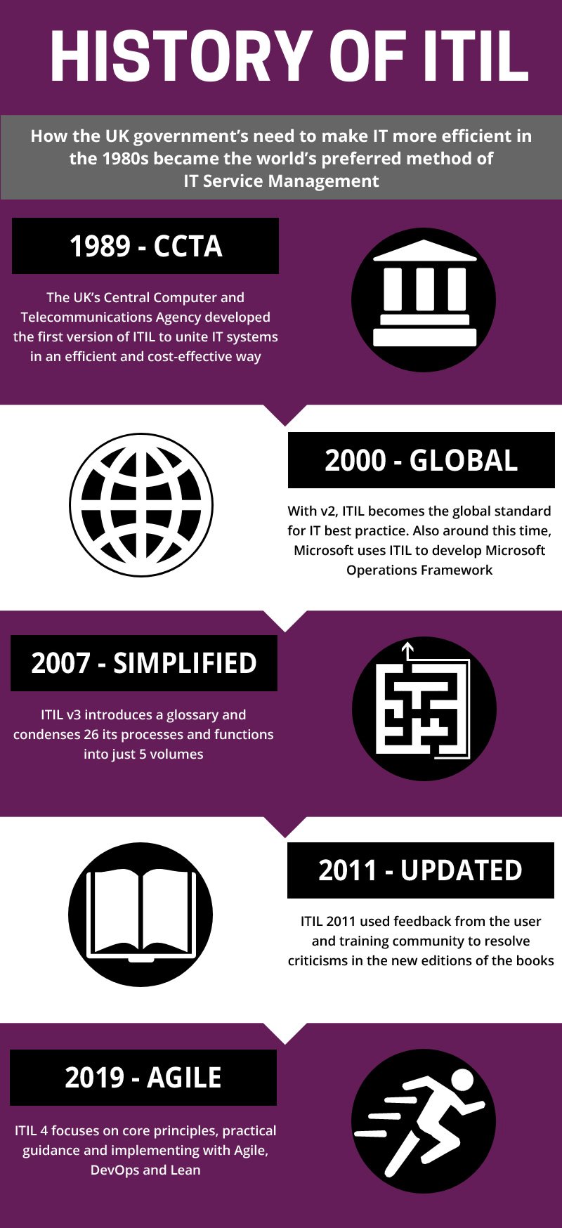
Shortly thereafter, the first iteration of Information Technology Infrastructure Library (ITIL) emerged, called the Government Information Technology Infrastructure Management (GITIM). These guidelines outlined a set of practices, processes, and policies organizations could follow to ensure their IT infrastructure was set up in such a way to support their business needs. The ITIL standards were inspired by the process-based management teachings of productivity and management guru W. Edwards Deming.
Over the years, we’ve seen many iterations of ITIL. The most recent version of the standards, ITIL 4, was released in February 2019. In large part, this iteration was influenced by the agile approach to software development and the rise of DevOps teams. Both of which have transformed the way we think about technology.
Keep reading this post to learn more about:
- What ITIL is?
- The pros and cons of ITIL?
- How ITIL has changed over time?
- How, specifically, the rise of agile workflows and DevOps teams impacted ITIL 4?
What Is ITIL?
Life would be difficult if it were impossible to learn from other people and we had to figure everything out by ourselves. Good thing that’s not the case.
At a very basic level, ITIL is a framework that outlines the best practice for delivering IT services throughout the entire lifecycle. Organizations that follow this framework put themselves in a great position to stay on the cutting edge of technology and leverage the latest tools and philosophies that drive leading innovators forward today. They are also able to respond to incidents faster and enact change management initiatives with more success.
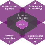
At a high level, there are five core components of ITIL 4:
- Service value chain.
- Practices.
- Guiding principles.
- Governance.
- Continual improvement.
Now that we’ve got our definitions locked down, let’s shift our attention to the pros and cons of enacting ITIL at your organization.
What Are the Pros of ITIL?
ITIL is popular for good reason. The framework helps organizations big and small optimize their IT infrastructure. It also helps them secure their networks and realize productivity gains.
More specifically, ITIL enables organizations to:
- Keep IT aligned with business needs, ensuring that the right infrastructure is in place for the task at hand. For example, a team that has a mobile workforce should leverage cloud platforms that enable employees to work productively from any connected device.
- Delight customers and strengthen user experiences by improving the delivery of IT services and maintaining a network and infrastructure that works as designed and meets modern expectations.
- Reduce IT costs and eliminate unnecessary expenditures by ensuring that IT infrastructure is optimized and efficient. For example, if you’re storing petabytes of duplicative data for no reason, best practices would tell you that you need to do a lot of culling to save on storage costs.
- Gain more visibility into IT expenses and infrastructure to better understand your network and detect inefficiencies that can be improved. For example, if your software development team has recently started using containers to build applications, you might not need to run as many virtual machines anymore, which drain more computing resources.
- Increase uptime and availability due to increased resiliency and robust disaster recovery and business continuity plans. This is a big deal because downtime can be prohibitively expensive, depending on the scale of your organization. Just ask Amazon.
- Future-proof tech infrastructure to support agile workflows and adaptability in an era where customer needs shift overnight and competitors are always just a few taps of a smartphone away.
What Are the Cons of ITIL?
But like everything else, ITIL by itself is not a panacea. You can’t just hire some consultant who will preach the virtues of ITIL and expect to transform your IT operations overnight.
While the benefits of the framework speak for themselves, you need to be realistic about shifting to a new approach to IT management. However, with the right approach—which includes training, patience, and reasonable expectations—your organization stands to benefit significantly by adopting ITIL.
How Has ITIL Changed Over the Years?
ITIL initially emerged because more and more organizations were using new technologies but nobody really knew how to manage them effectively. Companies were largely using technology because they could—not because they were making strategic investments to support their customers and business needs. The initial iteration of ITIL found that most companies had the same requirements and needs for their IT networks, regardless of size or industry.
At the turn of the millennium, the second iteration of ITIL came online. In large part, this version consolidated and simplified the teachings and documentation from the inaugural ITIL framework.
In May 2007, ITIL 3 came to the surface. This third iteration included a set of five reference books called Service Strategy, Service Design, Service Transition, Service Operation, and Continual Service Improvement. ITIL 3 picked up where ITIL 2 left off, further consolidating the framework to make it easier for organizations to implement.
Four years later, ITIL 3 was revised once more, primarily to maintain consistency as technology evolved.
Introducing ITIL 4
Fast forward to 2019, and the most recent version, ITIL 4, is where we’re at today. Quite simply, ITIL 4 was issued to align the standards with the agile and DevOps workflows that have grown to dominate technology teams over the last several years. ITIL 4 includes two core components: the four dimensions model and the service value system.
At a high level, ITIL 4 represents more of a change in approach and philosophy than a change in content. Just as software teams adopt agile and DevOps workflows, IT must adopt a similar mindset if they wish to keep pace and support accelerated innovation. At the end of the day, IT is a cornerstone of the success of the modern organization. It’s imperative that IT support the new way of working if an organization wishes to reach its full potential.
How Have Agile and DevOps Impacted ITIL 4?
In the past, software teams would build monolithic applications and release maybe once a year. Today’s leading software development teams have embraced agile development and DevOps workflows. Slowly but surely, monthly releases are becoming the norm. Development is becoming more collaborative, too, with both colleagues and users steering the product roadmap.
ITIL 4 recognizes and supports this new way of working with new core messages:
- Focus on value.
- Start where you are.
- Progress iteratively with feedback.
- Collaborate and promote visibility.
- Think and work holistically.
- Keep it simple and practical.
- Optimize and automate.
Where Does Your Organization Stand?
If your company hasn’t yet implemented ITIL, what are you waiting for?
Whether you’re a startup or your organization has been around forever, ITIL serves as a guiding framework. Follow it and it enables you to protect your networks, support your developers, and delight your customers.
And what exactly is the alternative, anyway? Running your IT department like the Wild West?
With so much on the line, you can’t afford that risk. So become an ITIL-driven organization. That way, you’ll get the peace of mind that comes with knowing your networks and infrastructure are secure and support innovation and agility.
What’s not to like?
Author Justin Reynolds
This post was written by Justin Reynolds. Justin is a freelance writer who enjoys telling stories about how technology, science, and creativity can help workers be more productive. In his spare time, he likes seeing or playing live music, hiking, and traveling.
